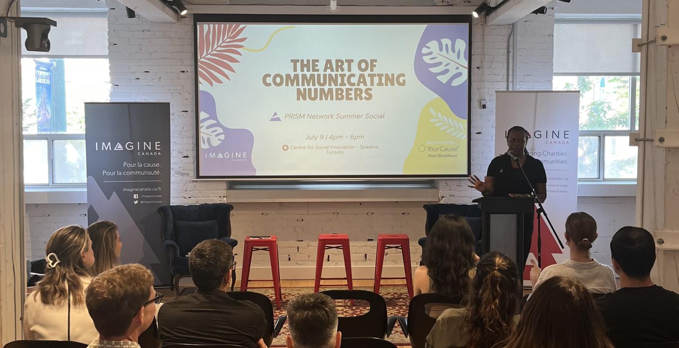
How do you turn dry data into stories that spark action? That was the challenge we tackled in July at The Art of Communicating Numbers, part of the PRISM Network Learning Series. Sponsored by YourCause from Blackbaud, the lively in-person and virtual sessions brought together social impact professionals to learn how to transform sterile statistics into messages people can feel, remember, and act on.
Drawing inspiration from Making Numbers Count by Chip Heath and Karla Starr, participants explored practical, creative techniques to make every figure count, whether in ESG reports, social impact updates, or community presentations. Because in a world awash with data, the real power lies in helping audiences grasp why the numbers matter.
Why Numbers Need Translation
Our brains are built to process only small numbers well – think one to five, or maybe up to ten. Beyond that, scale becomes hard to grasp. The difference between 10 and 20 feels big; 340 to 350 barely registers. And the gap between one million and one billion? Nearly impossible to visualize without context.
That’s why every number, especially in social impact work, needs translation into human, relatable terms. Translating numbers into vivid, accessible concepts turns them from background noise into stories people remember and act on.
Five Rules for Making Numbers Count
1. Avoid numbers when you can.

Sometimes the most memorable way to make a point is to drop the numbers altogether. E.l.f. Beauty’s “So Many Dicks” campaign, comparing the number of men named Richard, Rick, or Dick on U.S. corporate boards to the number of racialized women, makes its case in just three words, without relying on anyone remembering the actual figures.
2. Focus on one at a time.
Large-scale stats can be powerful, but breaking them down to a single relatable unit makes them stick. UNICEF’s World Water Week campaign turned “200 million hours a day spent collecting water” into: one woman starting in the Stone Age and not arriving home until 2016. That shift from a global total to an individual experience changes how we feel about and understand the number.
3. Use small whole numbers, rounded with enthusiasm.
Our short-term memory can handle only about seven digits. Converting figures into “small baskets” – like “three out of four” instead of 75% – makes them easier to remember. The Gates Foundation distilled a 51% drop in child mortality into: the number of children dying each year has fallen by more than half.
4. Ground numbers in a concrete, familiar, and human scale.
Abstract figures become more meaningful when tied to something your audience knows. A World Wildlife Foundation report translated “16 million acres of deforestation” into an area “bigger than West Virginia.” For a Canadian audience, that might translate to ‘bigger than Nova Scotia.’ The right reference point makes the scale instantly clear.
5. Use contrast and comparison for emotional impact.
A surprising comparison can make a number unforgettable. The nonprofit sector employs 2.5 million Canadians – more than construction, manufacturing, or retail. Or consider Oxfam’s framing of billionaire wealth: since 2020, the richest 1% has gained $42 trillion. That’s nearly twice as much as the wealth of the other 8 billion people on Earth combined. These kinds of contrasts don’t just explain the number – they make it impossible to ignore.
From Data to Connection
Participants left with a simple but powerful takeaway: data matters, but connection matters more. Translating numbers into something people can visualize, feel, and remember ensures your message lands and sticks.
Whether you’re making the case for a community investment, reporting on program impact, or rallying support for a cause, these five rules offer a roadmap to stronger, more resonant storytelling.
Want to keep building your impact storytelling skills?
Join the PRISM Network for future sessions in our PRISM Network Learning Series where we explore how to connect data with purpose – and people. And whether you missed the live session or want to revisit the insights, you can watch the virtual session recording here.


